
Drawn with the ‘Real G-Pen’ in Clip Studio Paint.
Richard Bell's nature sketchbook since 1998
Drawn with the ‘Real G-Pen’ in Clip Studio Paint.

Another day at the Hospice but, because we’ve got a few extra visitors this morning, I head down across the racecourse, under the M62 and over the railway at Glass Houghton Station for a coffee break at Junction 32 Freeport.
On my return walk through the strip of woodland alongside the railway, robins and blue tits are singing, a wren investigates the undergrowth and a sulphur-yellow brimstone, the original ‘butter fly’, flies determinedly but erratically, zig-zagging along the scrubby hedgerow in a roughly north-westerly direction,

We accompanied Barbara’s brother John in a wheelchair on a circuit of the Hospice grounds this morning.


The light was fading when we arrived at the hospice so this evening it was still life rather than landscape in my pocket sketchbook.


Another exercise in not lifting the pen from the paper as I draw. Colour and negative colour added in Photoshop.

The fast food at the Falafel Street Kitchen was a tad too fast for me and this was as far as I was able to get in sketching the customers.

Luckily the pace at the Nats’ AGM was a little more sedate. Even so, these days we get through the business side of the evening in a little over fifteen minutes.

Rather than go for regular architectural drawings I’ve used the exercise of drawing without lifting the pen from the paper for this facade of Harewood’s Grand Lodge for next month’s John Carr anniversary show in Horbury’s Redbox Gallery.
The split complementary colour scheme comes from my experiments with Procreate.

I’m going to experiment with 3D versions, building up the facade in card.

Like a scene from Peter Rabbit, a woman walks up the garden path to Hilary’s cafe with a large bunch of fresh carrots, holding them by the lush ferny foliage of the carrot tops.
She’s soon back down the shed, returning again with three Petanque boule-size beetroots, again with fresh-looking foliage.
“I only came here for a cup of coffee!” she explains.

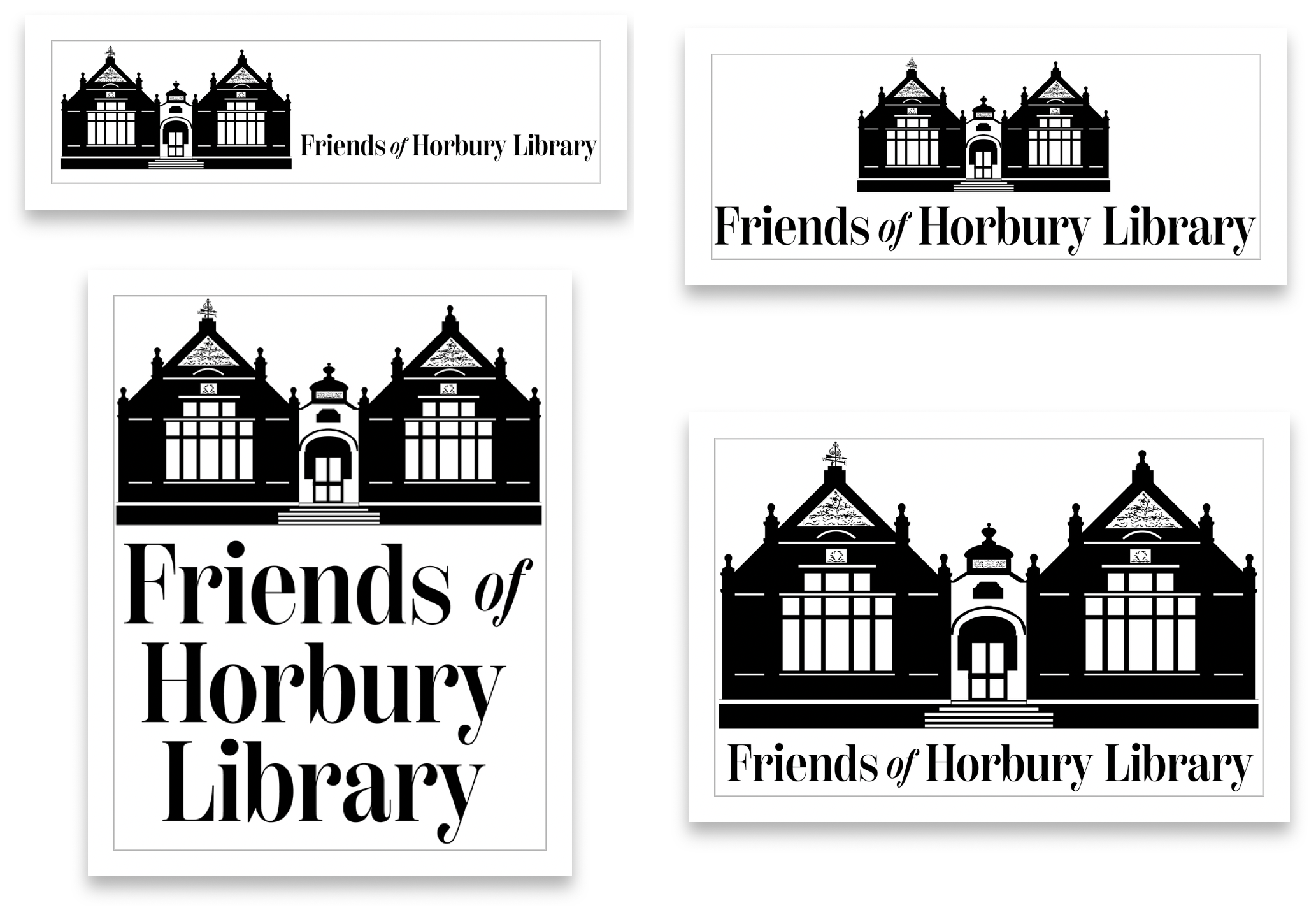
Some possibilities for using the library logo in a letterhead. Hopefully the secretary won’t be misquoting Cicero’s Latin as in the placeholder text of my mocked-up example.

As a complete change from the graphic symmetry of the library logo on our day off in Harrogate today I’ve gone for a freeform drawing exercise, suggested by Ian Burke of the Staithes Gallery on a recent episode of Robson Green’s Weekend Escapes.
In contrast to all the planning that went into constructing the library facade for the logo, the aim here is to keep your pen on the paper and just keep drawing.

I know what you’re thinking, even for a freeform drawing isn’t that too wobbly? But I was drawing through the windows of the Palm Court Cafe above Farrar’s so I was looking through the rippled glass leaded lights of the cafe’s windows.
The Crown Hotel, Harrogate
Palm Court Cafe, Harrogate